When it comes to creating a relaxing space, the role of color can’t be overstated. Colors have the power to influence our moods, thoughts, and even our stress levels. Whether you’re cultivating a serene environment for meditation or simply unwinding after a busy day, the right color palette can have a profound impact.
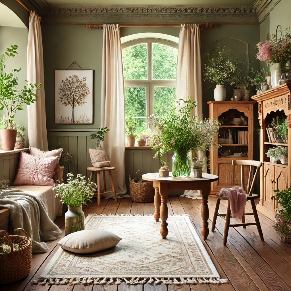
In this post, we’ll explore how various colors, including those in my favorite palette—olive green, green, tree brown, pastel pink, cream, black, and splashes of red—can contribute to relaxation and help you create a peaceful, cozy sanctuary.
Olive Green: A Grounding and Calming Hue

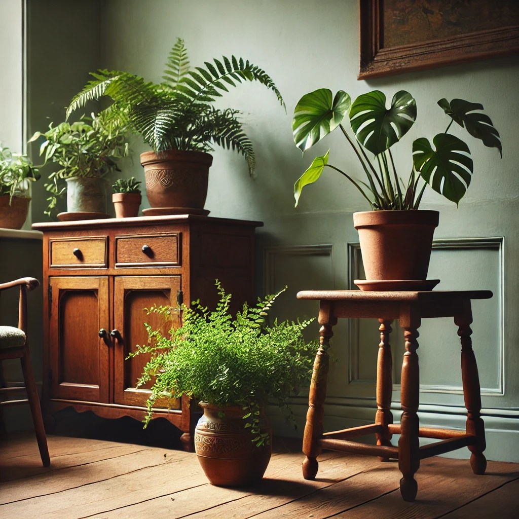
Olive green is a beautiful blend of green and brown, making it the perfect color to evoke feelings of balance, stability, and relaxation. This earthy tone brings the outdoors inside, helping you feel grounded, like you’re surrounded by nature. It calms the mind and helps reduce anxiety, making it ideal for spaces where you want to retreat and recharge. In a cottagecore-inspired space, olive green works wonderfully in nature-themed decor and alongside lush plants, creating an immersive, peaceful environment.
Green: Refreshing and Rejuvenating
Green is often associated with nature and renewal, and its calming effects on the mind are well-documented. It’s known for reducing stress and promoting relaxation by lowering blood pressure and creating a sense of tranquility. Whether it’s a deep forest green or a lighter sage, green helps evoke feelings of peace and contentment. In a fairycore or cottagecore-inspired room, green can be used on accent walls, soft furnishings, or woven through natural materials like wood and linen. It encourages a sense of connection to the earth and its cycles, making it the perfect shade for fostering inner peace.
Tree Brown: Earthy and Soothing
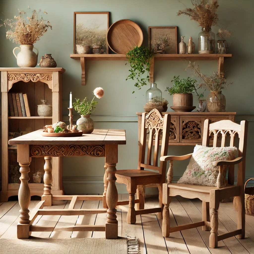
Brown, especially tree brown, brings a sense of stability and warmth to any room. As a color rooted in nature, brown is deeply grounding and can make a space feel cozy and comforting. Tree brown is especially perfect for cottagecore settings, evoking the image of wooden cabins or forest floors covered in fallen leaves. This color helps to create a cozy atmosphere where relaxation comes easily. It pairs beautifully with olive green, adding depth and richness to your space without overwhelming the senses.
Pastel Pink: Soft and Gentle Comfort
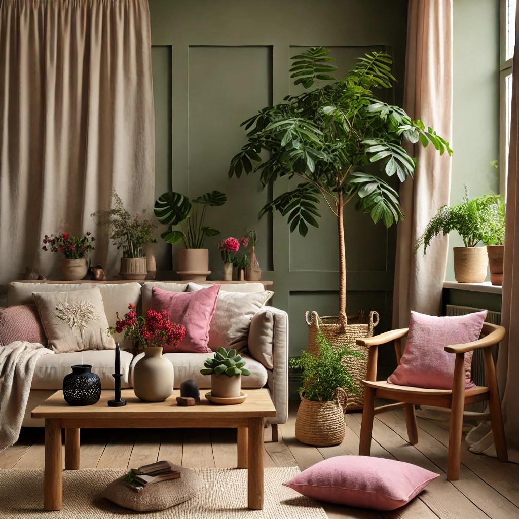
Pastel pink is known for its soothing and gentle qualities. It’s a color that radiates warmth and tenderness, perfect for creating a calming, nurturing environment. This soft hue is often used to promote feelings of kindness, compassion, and love, making it an ideal choice for relaxation spaces. In a fairycore or cottagecore room, pastel pink can add a touch of whimsy and sweetness. Think of delicate floral accents, light fabrics, and soft pillows. Pastel pink can be paired with other calming colors like olive green and cream to create a peaceful balance between soothing warmth and earthy tones.
Cream: Serene and Elegant

Cream is a neutral color that acts as a calming backdrop to other, more vibrant tones. Its softness and elegance create a peaceful atmosphere, making it a great choice for relaxation. Cream works particularly well in spaces inspired by cottagecore and fairycore aesthetics, where it complements natural wood tones and soft, rustic decor. It also helps reflect light, creating a more spacious and airy feeling in any room. By pairing cream with olive green, tree brown, and pastel pink, you can create a serene environment that feels both cozy and refreshing.
Black: Deep and Protective
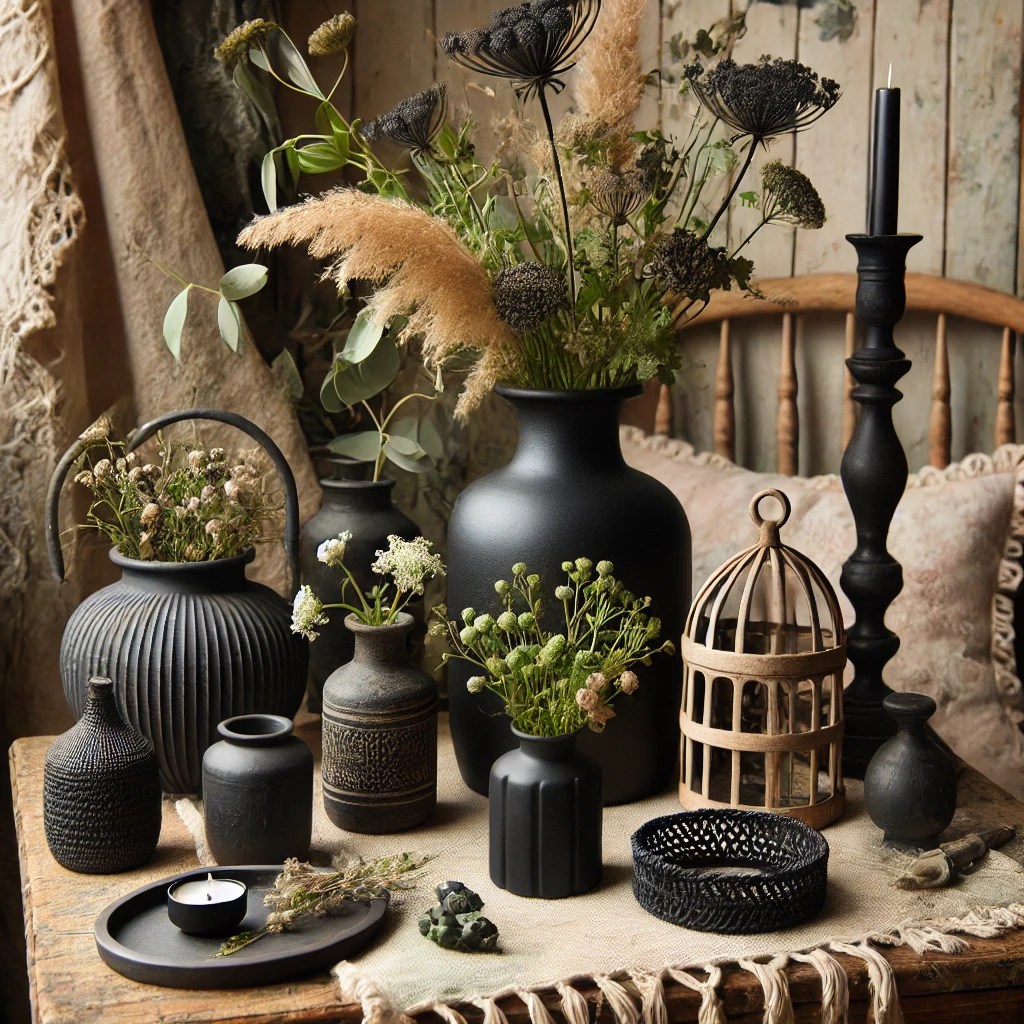
While black might seem like an unlikely choice for a relaxation space, it has its own unique benefits. Black is often seen as a protective color, creating a sense of safety and privacy. In small doses, black can add depth and sophistication, especially when paired with softer, lighter tones. In a room inspired by the witchcore or fairycore aesthetic, black can represent mystery, grounding energy, and the beauty of the unknown. Think of black accents like decorative frames, dark wooden furniture, or intricate candle holders. It’s a grounding contrast to lighter hues like pastel pink and cream, offering balance to your space.
Splashes of Red: Invigorating and Energizing
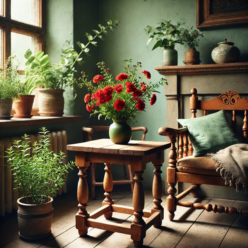
While most colors for relaxation lean towards softer tones, red can be used in small doses to add a bit of life and energy to the room. A gentle splash of red—perhaps in a flower vase, pillow, or artwork—can help awaken the senses without overwhelming the space. Red, when used sparingly, promotes passion, vitality, and inspiration. In your relaxation space, it’s a great way to introduce moments of vibrant energy without disturbing the overall calming atmosphere. For a cottagecore vibe, red can evoke the image of sunlit wildflowers or autumnal berries, infusing the space with warmth and richness.
Creating Your Ideal Relaxation Space

Incorporating these colors into your home decor can be as simple as introducing textiles in your favorite hues, such as olive green curtains, pastel pink cushions, or a cream-colored rug. Adding natural materials like wood, stone, or plants can enhance the calming effect of these colors. Whether you’re seeking a peaceful corner for reading, meditating, or just unwinding, the colors you choose will create an environment that supports your need for rest and relaxation.
By blending my preferred palette of olive green, green, tree brown, pastel pink, cream, black, and subtle splashes of red, you can craft a space that reflects both nature’s beauty and the cozy charm of cottagecore and fairycore aesthetics. Remember, it’s not just about how these colors look together, but how they make you feel. Choose the tones that resonate most with you and let them guide you to a place of deep relaxation.
Discover more from Naturing Relaxation
Subscribe to get the latest posts sent to your email.
